 Proudly Canadian!

The best gallery wall ideas all begin the same practical way: pick one wall, gather more art than you think you need, lay every piece on the floor until the spacing feels right, then hang from the center outward with a steady two to three inch gap between frames. That is the whole method in one breath. Everything after this is just refining it so the finished wall looks collected instead of cluttered.
Most walls that go wrong were never planned on the floor first. People hammer the first nail, hang the biggest piece, then try to build around it and end up punching extra holes into the drywall for an hour. Working flat on the ground removes that guesswork. You can shuffle frames around like puzzle pieces, step back, and only commit once the arrangement actually reads well.
A gallery wall also solves a very Canadian problem: long winters spent looking at the same four walls. A staircase, a hallway, the space above a sofa, or a narrow condo entry all come alive with a considered cluster of art. And you do not need a decorator or a big budget to get there. You need a plan, a level, and a handful of pieces you genuinely like.
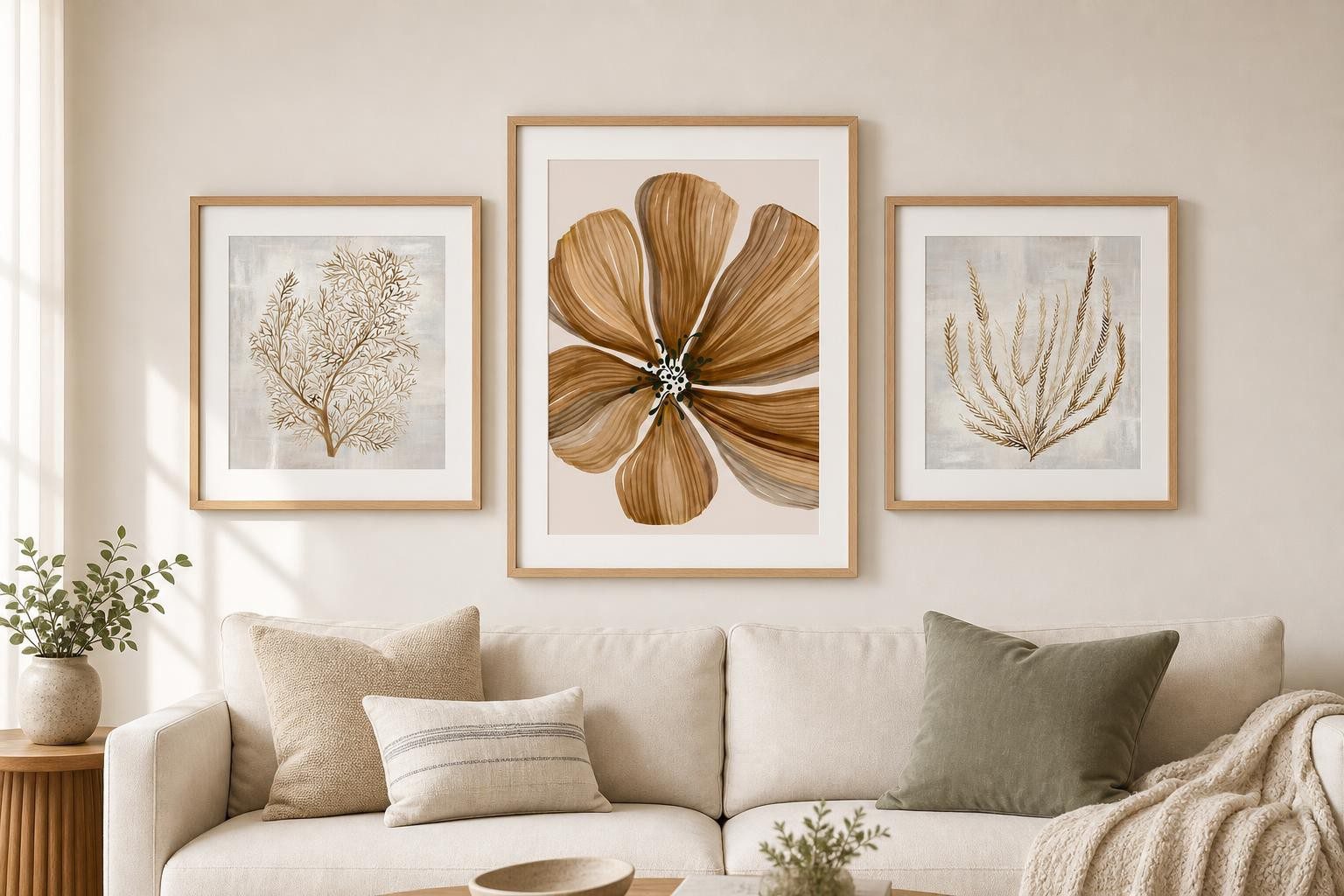
Start on the floor: gallery wall layout made simple
A good gallery wall layout starts as a paper exercise. Trace each frame onto kraft paper or newspaper, cut the shapes out, and tape them to the wall with painter’s tape before a single nail goes in. Move the paper around until the balance looks right, then hammer straight through the paper where each hook lands. It sounds fussy. It saves you a wall full of extra holes.
Keep the spacing consistent. Two to three inches between frames reads as intentional across almost any arrangement, whether you are going for a tidy grid or a looser salon-style cluster. If you are ordering prints to fit specific frames, our print size calculator takes the math out of matching image dimensions to the frame and mat you have in mind.
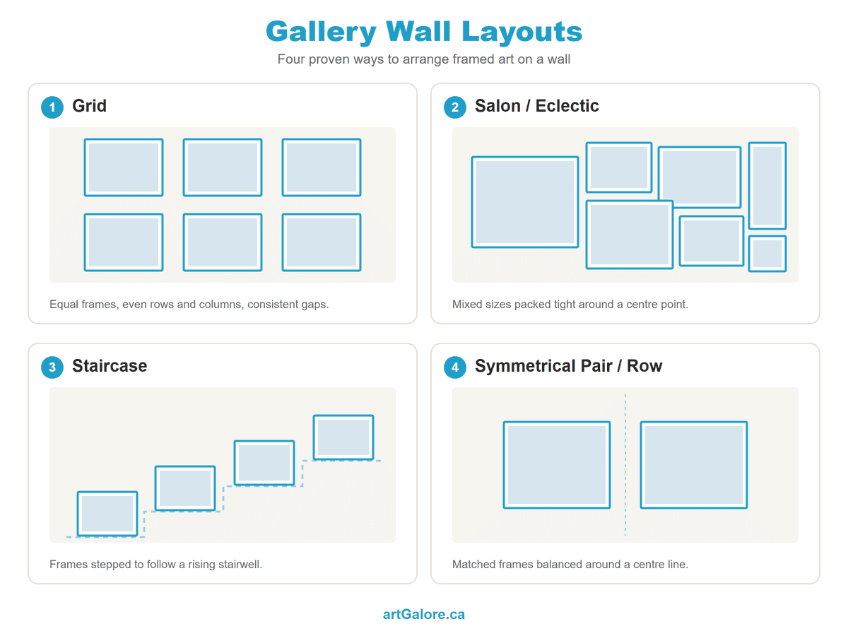
Gallery wall ideas that actually hold together
Cohesion is what separates good gallery wall ideas from a pile of random frames. The easiest way to get it is a shared thread running through every piece. That thread can be a colour story (all warm neutrals, or all blues and greens), a single medium, or one repeated frame style.
A calm, neutral piece of abstract art like this earthy organic form is a reliable spine for a mixed wall. Its muted palette gives louder pieces permission to sit beside it without competing.
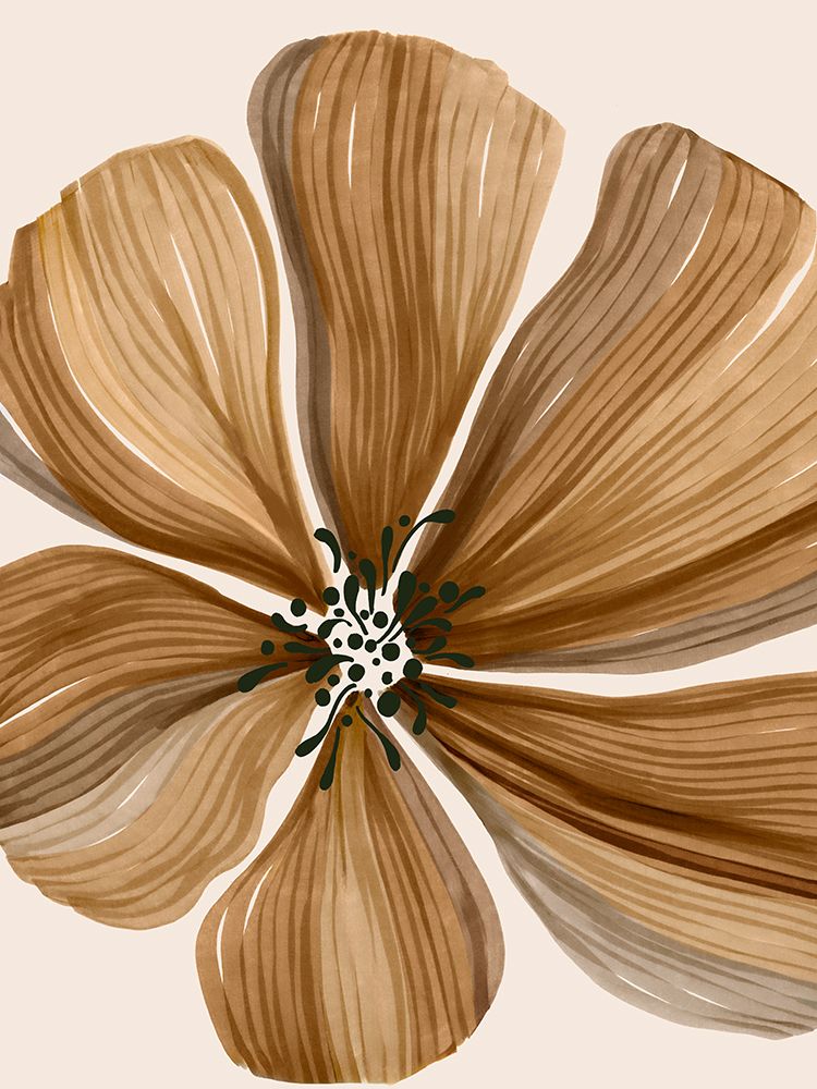
Give the wall one piece to anchor it
The gallery wall ideas that photograph best usually have one clear hero. Pick a larger piece to anchor the group, place it slightly off centre, and let the smaller works orbit around it. A bold portrait or a big statement image on canvas prints does this job well, because the texture and scale pull the eye in first, then release it to the rest of the wall.
If your art leans warm and floral, that same anchor logic applies. One generous piece of floral wall art can carry a whole spring-toned cluster on its own.

Add contrast with black and white
Once the wall has a colour thread and an anchor, one piece of high-contrast black and white wall art keeps the whole thing from going flat. A moody monochrome photograph, like this long-exposure coast, adds depth and a moment of quiet between more colourful frames. It works like a rest note in a piece of music.
This is also where photo wall ideas earn their place. Family photos printed in matching black and white, hung in identical frames, turn a personal collection into something that looks designed rather than accidental.

Frames, mats, and the finishing touches
Matching frames give you calm and order. Mixed frames give you character. Both work, as long as you commit to one approach across the wall instead of drifting between them. A wide mat around a small print makes it feel more important and buys breathing room between images.
For a piece you want to keep for years, or one with an awkward size, custom framing lets you match the moulding and mat to the room instead of settling for whatever the shelf had in stock. It is the difference between art that sits on a wall and art that belongs there.
Start with what you love
The dense, floor-to-ceiling gallery wall is not a new trend. It goes back to the crowded hangs of the 18th-century Paris Salon, where paintings covered every inch of wall from the dado rail to the ceiling. The modern version is calmer, but the instinct behind it is the same: surround yourself with art you love, arranged with a little intention.
The strongest gallery wall ideas start with pieces that make you want to look up on a grey afternoon. Get those right and the layout tends to follow.
→ Browse our most popular prints at artGalore.ca to find your anchor piece and the frames to build around it.